The Khanin Diagram: how to visualize a two-sided business model
I came into unit economics more than ten years ago, and the first real problem I hit was calculating unit economics for a marketplace — two sides, sellers and buyers, where the product is free for buyers and sellers pay for access to them. That's where the Krasinsky-Khanin formula came from, and that formula has shaped most of what I've worked on since.
The math was solved a long time ago. What I never figured out was how to draw the path from users to money. Even in the calculation itself I tried to show two sides as two linked rows in the model — but it was hard to read and uncomfortable to compute. So in the end it always collapsed back into a single row in tools like ueCalc.
Right now I'm working with a company that runs classifieds. We operate across several countries and I'm rolling out data-driven culture, unit economics, all the usual stack. And the visualization problem came back, harder than before.
Since the company is AI-driven, my first move was to ask Claude design to come up with something. It couldn't get past a classic Sankey diagram.
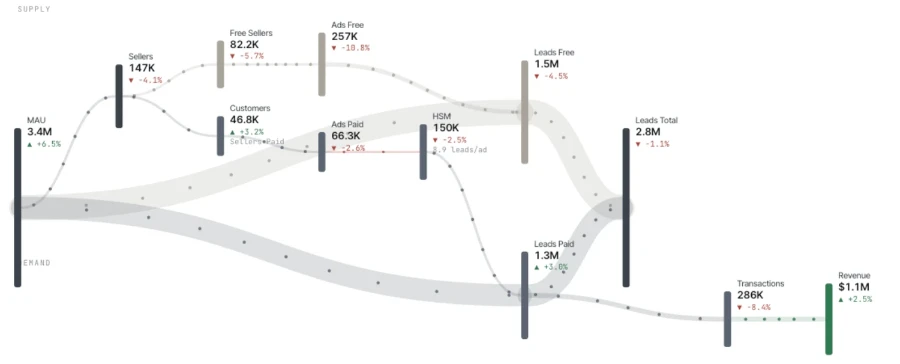
The hard part was explaining that this is a two-sided process. I needed to show that MAU is shared, that it then splits into sellers and buyers, that sellers create listings, that buyers react to them — and that some sellers also pay extra to get their listing seen.
What I got back was funny in a bad way. The model invented metrics that weren't in the brief, weren't in the references, weren't anywhere. It made up flows and directions. The task turned out to be genuinely hard.
Eventually I thought: what if I point the flows toward each other? We have buyers and sellers; they meet on listings; we call those meetings leads. So make them collide.
Then: what if MAU — the shared source of everything — wraps around the diagram instead of sitting on top? I sketched this in a notebook:

The idea worked. Explaining it to an agent did not. I tried having one agent write the brief for another. None of them got what I wanted. The hardest thing to communicate was: I want flows like in a Sankey, but pointed at each other.
After more attempts than I'm willing to count, I got this:
This is exactly what I wanted. There's room to make it prettier, but the concept is right. The outer ring is the shared data source — in our case, MAU. Inside it, two flows — sellers and buyers — move toward each other and intersect where listings meet leads.
Sellers split into paying and non-paying. Paid listings produce revenue, and that revenue sits at the center of the diagram — the goal of the business.
How to read it: start at the outer ring, the shared data source for the model. Then follow the flows inward, stage by stage, until they meet.
What you immediately see is which chain produces money — the center of the Khanin diagram — and how that chain depends on the other half of the model, without which the money side simply doesn't work.
This works for any two-sided business: marketplaces, edtech, HR, sharing economy, media. I've prepared an LLM prompt you can use to generate your own Khanin diagram, and a library for building it programmatically. The library is distributed under BSL 1.1.
Unit economics & financial modeling in practice
50€/year
less than €1/week · billed annuallyPlus: theme customization, font settings, article printing and image zoom.
Subscribe to get access.
If you're already a customer, just log in.
we do not store your email, only the encrypted hash, which increases the security of your email.