Different scenarios of using a metric tree
A metric tree is a popular tool for analysing current business processes and for understanding which processes drive the improvement of a given process.
The original concept was described as a pyramid, but that metaphor never worked for me, so I switched to the term metric tree. Recently I have been leaning towards calling this object a metric graph, especially when the business model is complex.
There are plenty of materials on building a metric tree written by different authors. Often these are based on personal experience, but sometimes they are purely theoretical pieces that reflect nothing more than the author's hypotheses.
Right now I am working with three metric graphs that describe the same company and the same business processes. So why three?
The first graph describes how the metrics we use to describe business processes are connected with the target business indicator, which in my case is classic company profit, or EBITDA if that is easier. I build these connections from the bottom up, starting from the data that we collect through event tracking, that is, from event analytics. This graph shows how we move from data to profit.
The second graph solves the reverse problem. It is built from profit towards process metrics, top down, the way it is usually done.
The third graph is the smallest one. It shows connections from the bottom up, but only for the data that we actually collect and can use to track the links between metrics.
I want to share how I deal with such a graph in practice.
Building a metric graph
Let's start with the question of how to create a metric graph in a way that is convenient and fast.
I used to build metric trees in Miro. Overall it is a very convenient tool for creating schemes, connections and diagrams. The interface is simple and clear, and the visualisation of the connection lines looks nice. But it turned out to be not very convenient specifically for building metric trees.
Directions
A metric tree is a directed graph. We do not just link two nodes together, we also specify that one node depends on another, and the direction of that link really matters.
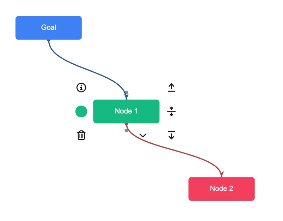
Connections between three nodes, Node 1 depends on Node 2 and influences Goal. I find it convenient to show such connections by colour. A red connection means that the current node has dependent nodes. A blue connection means that this node influences other nodes. That is the simplest element that I personally missed in Miro.
It is important to understand that if I select Node 2, all connections going up from it will be blue, because Node 2 is a terminal one. It does not depend on other nodes, yet it influences Node 1, which in turn influences Goal.
In the same way, if I select Goal, all connections will be red, because every node influences it.
Formulas
The second important point when building a metric graph is that a connection is not just a nice line on the canvas. A connection is a mathematical formula that shows exactly how the metrics are related.
The mathematical link is what separates action metrics from vanity metrics. A vanity metric is a metric whose change does not lead to a clear change of the target metric. On its own it can be very important, but for a product manager's work it is useless, precisely because there is no clear mathematical relation.
In the article Non monetary metrics on a metric tree I described how to connect metrics when a direct mathematical formula of the form X = A + B cannot be found, yet a relation exists and needs to be established.
Cyclic connections in a metric graph
There are metrics that have a cyclic connection. The simplest example is UA, B and C1. All three are linked by a simple formula:
B = UA×C1
But this connection is cyclic, and the direction depends on what we already have and what we want to get at a particular moment. For example, we want to obtain the actual value of metrics, such as Gross margin, and to calculate it we need all three of these metrics.
At the same time, the values that the business collects give us UA and B, while С1 is calculated by the formula:
C1 = B/UA
This gives us the following pattern of relations between metrics. The metric C1 depends on UA and B, which in turn are linked to event analytics.
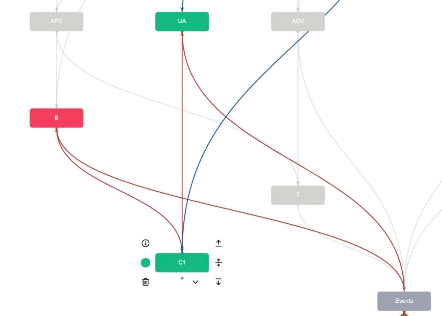
This approach lets us calculate the correct values of the metrics. I call these values actual, or simply fact.
When it comes to planning, however, when we answer the question of which metrics need to change in order to improve the target indicator, we can use neither this formula nor the values of metric B themselves. We simply cannot plan this metric.
For planning we use a different approach. We influence the metrics UA and C1, and we derive the metric B from the formula
B = UA×C1
As a result, the metric graph gets different dependencies. Whereas before the metric C1 depended on UA and B, during planning the metric B depends on UA and С1.
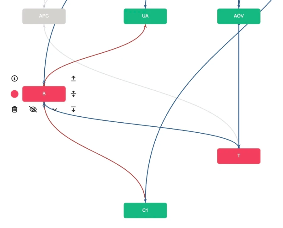
In this case the metrics C1 and UA are no longer linked to events, because their values are final for us and we plan them directly.
In effect, we have one business, one set of business processes, one metric tree and even one formula linking some of the metrics together, but the direction of connections differs depending on the task. How can we reflect that?
Metric Tree Studio
Let me share the solution I chose for myself, which is Metric Tree Studio. It is a dedicated tool for drawing a metric graph that lets you assemble a graph fairly easily and in a familiar way, almost like in Miro.
This solution lets you define connections between metrics, set formulas, assign metric values and see how the target indicator changes.
Within our task, this tool lets you create different usage scenarios, namely the fact and plan values. You build one tree, and then you create a scenario that shows the differences.
After that you simply switch between scenarios, which gives you a single graph both for understanding how the target indicator is derived from data and for deciding which metrics should be changed in order to improve it.
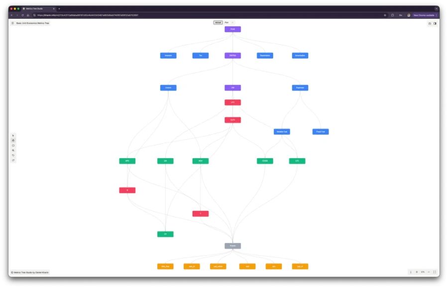
The first scenario is fact, showing how the target indicator is obtained from event analytics data.
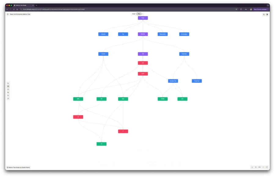
The second scenario is plan, showing which metrics need to change in order to reach the target value of the indicator.
You can also hide nodes that are not relevant to the current scenario. For example, the event analytics data nodes are not needed for the planning scenario.
Example
In this interactive block you can see what a metric tree built in Metric Tree Studio looks like and how it implements these two usage scenarios.
As you can see, this approach lets you easily assemble a metric graph, and do it for several usage scenarios at once. In the second scenario (Plan), some metrics are hidden, and connections and formulas are rearranged.
To use this tool for your own needs you will spend no more than one cup of coffee per week, less than 1€. That seems to be much less than what you would spend on tokens trying to vibe code such a tool yourself.
A few keyboard shortcuts that might come in handy:
i – shows information about the active node
s – shows a sidebar with information about the active node and its connections
t – switches the theme (light or dark)
h – node selection mode
v – group selection mode
z – zoom mode
In the next materials I will show how to define formula based connections and how to use data for visualising metrics.
Unit economics & financial modeling in practice
50€/year
less than €1/week · billed annuallyPlus: theme customization, font settings, article printing and image zoom.
Subscribe to get access.
If you're already a customer, just log in.
we do not store your email, only the encrypted hash, which increases the security of your email.